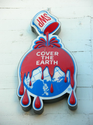
Ah what a difference a visual makes. They developed it toward the end of the 19th Century, and Sherwin-Williams still uses this horrific logo:
It actually leaves me breathless, it’s so horrible. On the same building where the above sign appears is this mural (or at least was – I haven’t been back there for a while):
Seriously. What the hell? This time it’s personal!
Well, someone is at least making an effort to be true to SWP’s horrific tagline—”Cover the Earth” (I almost wish I had made that up)—and still make something aesthetically pleasing and that, you know, doesn’t invoke the Union Carbide Bhopal disaster.

See an animated ad on this theme – worth going just for the cardinal depiction. The frog is also awesome. Dear SWP, notice how, in the animation, your logo only appears at a distance where it—and its apocalyptic tagline—cannot be readily discerned. Smart!


